Monday, 19 February 2018
Individual poster analysis
The poster idea that I have made is a teaser poster for the film as the other people in the group have created more revealing posters. So instead the poster that I have created is not very revealing and has a more of a minimalist design to instead just tease the target audience of what the film may be about. This is done by having prime numbers all in the background of this and the title of the film at the top, this instantly tells the audience that there is something to do with prime numbers and that is a key part of this film. Also the swirling pattern that overlays the prime numbers creates quite a disorientating effect and the intention of this is to make whoever looks at this poster feel like Thomas feels throughout the film when he sees the prime numbers. I wanted to design a poster that was slightly different to the rest of my group so we could compare them and perhaps even use more than one of them as mine is a teaser poster which could just peak the interests of my target audience and then one of the other posters could be used to reveal more about the film with features such as the main characters being on there, quotes about the film, release date and age certificate. I decided to use a blood red colour for the font of my title for the frightening connotations that come from red such as fear, passion and death, typically something that is used more in horror posters which I did take some inspiration from.
Sunday, 18 February 2018
Individual Prime Time poster analysis
For our film Prime Time, I decided to make a poster as a form of advertisement. As you can see from the poster on the right, the title "Prime Time" is featured right at the top in the same font as the cast's name just below them. This is to make that specific information stand out and to grab the audience's attention which is very important as the title is supposed to give them an idea of what the film is going to be about. Below is a picture of Lewis Hamer's eye which was edited by me using Adobe Photoshop. I decided to get four prime numbers and decorate them around his pupil to symbolise a clock. I decreased the opacity of the numbers to make it look more realistic. This was to convey the message that the prime numbers are taking over Thomas' life which again correlates with the title itself hence enticing the audience and making them wonder what the prime numbers exactly mean. I placed the numbers in a clock like manner to emphasise how Thomas' life is ticking away due to Vincent's abuse and is forced to be a slave to his company.
I also decided to add some quotes on the image which is a common trait of real life posters. This creates that sense of professionalism and gives the audience an early opinion of the film. For example, "It's a must see" instantly implores the viewer to see the film as the quotes are usually from film critics. Finally below the image is the cast illustrating roles, directors, editors, etc. This is all styled with the font "steel tongs" which is again a common feature used in most film posters. Overall the design is very black and white which was designed like this to convey the message of emptiness due to the dull colours used. It is also quite suitable for the genre as people wouldn't expect to see vibrant colours like red and green on a psychological thriller film poster.
I also decided to add some quotes on the image which is a common trait of real life posters. This creates that sense of professionalism and gives the audience an early opinion of the film. For example, "It's a must see" instantly implores the viewer to see the film as the quotes are usually from film critics. Finally below the image is the cast illustrating roles, directors, editors, etc. This is all styled with the font "steel tongs" which is again a common feature used in most film posters. Overall the design is very black and white which was designed like this to convey the message of emptiness due to the dull colours used. It is also quite suitable for the genre as people wouldn't expect to see vibrant colours like red and green on a psychological thriller film poster.
Saturday, 17 February 2018
Before You Go To Sleep film poser anaylsis
 We decided to create individual film posters for our film Prime Time. Before that however, I decided to conduct some research into real life examples. I chose the poster for the film Before I Go To Sleep (Directed by Rowan Joffe, 2014) which is a thriller/mystery which tells the story of a woman who is suffering from a traumatic accident and thus remembers nothing from the previous days each time she wakes up.
The poster first of all has the title of the film below it which is set in a red font. This is used as red often has connotations of danger which gives the audience an idea of what the film is going to be, intriguing them. The poster's main image is a combinations of three close ups of the characters which is edited to resemble a mirror. This is used as mirrors are a typical convention used in the thriller genre where a character looks into a mirror, symbolising that there is two sides to them. It also has the cast above the the film's title which matches the order the characters are shown which creates familiarity for the audience to identify them. There is also text above saying "Who do you trust?" in all capitals which instantly intrigues the audience and catches their attention. The word trust is coloured in red while the rest are in white which gives the audience several hints of what the film is about as it can maybe symbolise how the main character doesn't know who's a friend and who's an foe. The red emphasises this of course due to the its connotations discussed above.
Finally, there is a list of the other cast such as directors and editors below it which is formatted with the font Steel Tongs. This is a very commonly used font when displaying cast information and I will look into using it on my own individual poster. Overall this analysis has given me a good idea of what my poster should include and the key aspects that indicate the film's genre.
Thursday, 15 February 2018
Idea for a viral ad
Viral marketing idea
 After conducting my research, the first thing I noticed was the use of the internet and social media. For my idea, I designed a digital tutorial based on Vincent's character, titled "How to be rich". This would include numerous pages of outrageous tips from Vincent that would establish his egoistical personality which would create familiarity with the audience for the character. It would also convey the comedic aspects of our film which would further implore the consumers to watch the film. To create more attention, there will be a quiz created by Vincent loaded onto the last page which asks blatant obvious questions and if the audience were to answer the questions correctly, they would unlock the trailer for Prime Time. Below is a screenshot of the cover I designed where I added the famous quote "Prime Time" which of course creates synergy with the film's title. The cover is also populated with information of what it includes which was purposely made to cringe the audience and again emphasise his egoistical personality. Some of the questions featured will also be quite aggressively phrased to also convey Vincent's abusive side. After the trailer is revealed, there is an option to share your score for the quiz on numerous social media platforms such as Facebook, Twitter and Instagram. This is vital as social media is a key aspect of viral advertising and will implore consumers on these social media platforms to share and discuss the campaign, for example sharing the answers.

 After conducting my research, the first thing I noticed was the use of the internet and social media. For my idea, I designed a digital tutorial based on Vincent's character, titled "How to be rich". This would include numerous pages of outrageous tips from Vincent that would establish his egoistical personality which would create familiarity with the audience for the character. It would also convey the comedic aspects of our film which would further implore the consumers to watch the film. To create more attention, there will be a quiz created by Vincent loaded onto the last page which asks blatant obvious questions and if the audience were to answer the questions correctly, they would unlock the trailer for Prime Time. Below is a screenshot of the cover I designed where I added the famous quote "Prime Time" which of course creates synergy with the film's title. The cover is also populated with information of what it includes which was purposely made to cringe the audience and again emphasise his egoistical personality. Some of the questions featured will also be quite aggressively phrased to also convey Vincent's abusive side. After the trailer is revealed, there is an option to share your score for the quiz on numerous social media platforms such as Facebook, Twitter and Instagram. This is vital as social media is a key aspect of viral advertising and will implore consumers on these social media platforms to share and discuss the campaign, for example sharing the answers.
Friday, 9 February 2018
Individual Research into Viral Adverts
Viral adverts
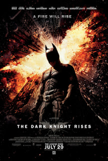
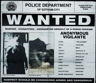
 Viral marketing is a method used by companies whereby consumers are encouraged to share information about the film and overall gain more attraction towards the film. A good example of this is with The Dark Knight Rises (Directed by Christopher Nolan, 2012) which is part of The Batman franchise and the film tells the story eight years after the previous film where Batman has gone into exile and hasn't shown himself to the people of Gotham city. Warner Bros. then launched a viral campaign where they uploaded a police document on the film's website which hinted at Batman's return and instructed them to take part in finding all the graffiti-ed white bat symbols around the world. The consumers were also implored to take a photo once they did find them and tweet to the company using huge social media platform Twitter using the hashtag "#TDKR20712" which stood for film's title and the release date of the film. This also created synergy with the film as it instantly matched with what the film is called and also the bat symbols which is part of the franchise's iconography. After all the bats were found, the trailer for the film was unlocked.

This was huge success as Warner Bros. had the huge budget to set up and execute something like this. It creates so much attention for the film as it was the unique interaction with the consumers was never seen before and this was evident as it was trending number 1 on Twitter at a time. It was also hugely successful as each bat found would unlock a piece of the trailer which means that the consumers would be eager to unlock the rest and find the rest of the bats. Due to it being on Twitter as well, people could interact and work together to find the graffiti thus creating even more exposure for the film.
 Viral marketing is a method used by companies whereby consumers are encouraged to share information about the film and overall gain more attraction towards the film. A good example of this is with The Dark Knight Rises (Directed by Christopher Nolan, 2012) which is part of The Batman franchise and the film tells the story eight years after the previous film where Batman has gone into exile and hasn't shown himself to the people of Gotham city. Warner Bros. then launched a viral campaign where they uploaded a police document on the film's website which hinted at Batman's return and instructed them to take part in finding all the graffiti-ed white bat symbols around the world. The consumers were also implored to take a photo once they did find them and tweet to the company using huge social media platform Twitter using the hashtag "#TDKR20712" which stood for film's title and the release date of the film. This also created synergy with the film as it instantly matched with what the film is called and also the bat symbols which is part of the franchise's iconography. After all the bats were found, the trailer for the film was unlocked.
This was huge success as Warner Bros. had the huge budget to set up and execute something like this. It creates so much attention for the film as it was the unique interaction with the consumers was never seen before and this was evident as it was trending number 1 on Twitter at a time. It was also hugely successful as each bat found would unlock a piece of the trailer which means that the consumers would be eager to unlock the rest and find the rest of the bats. Due to it being on Twitter as well, people could interact and work together to find the graffiti thus creating even more exposure for the film.
Thursday, 8 February 2018
Prime Time Film Poster Analysis
The poster for the film that I have created is a more of a
teaser trailer. It doesn’t reveal anything about the films: plot, characters,
setting, and time. Giving the audience of the poster a poster which shows there
is a film but only teasing at what it might include. Although not revealing
much at all, the general audience who will view and come into contact with this
poster may be able to make some accurate assumptions about certain elements of
the film. If I was a member of the audience which would view and see this
poster I would be able to make out that there is something very eary and suspenseful.
It looks like it could be a horror film or a thriller film where a lot will be
happening, but at the same time it looks physiological with the numbers all
over the wall which may show that there is something or someone who is going insane
or crazy, relating to the mind, so physiological. From the poster there is a
mystery feel as you leave yourself asking so many questions like: who it that
person with his back showing turned around? Why is he writing on the wall? What
does the writing on the wall mean? Is he insane? Is he a bad person or a good person?
Is he okay? Why is he in the dark? Why is his hood up? Etc. So with all these mystery’s
and questions, you leave the audience wanting to know more about the film.
Monday, 5 February 2018
Mid-production Questionnaire
This is our mid-production questionnaire for our film in which we are going to show a select amount of people our film and then give them this questionnaire for them to answer. After this we can then gather their answers and look at the results in order to see what we can add and change to our film in order to please our target audience and make our film better.
History of Psychological Thrillers - William Haines
History of Psychological Thrillers
Psychological Thriller is a genre that has a long history behind it. Successful films of this genre include hits such as 'Shutter Island' and 'Swan Lake'. These two films deal with emotions and mental health, which is something that we are tackling in our short film.
Psychological Thriller, as a genre, is prevalent more in book than in medias such as films. This is because as a genre, it is quite difficult to tackle.
One of the oldest Psychological Thrillers is the film 'Blackmail' (1929), directed by Alfred Hitchcock. It could be said that as an auter, a director, a writer, Alfred Hitchcock brought the genre in the medium of film.
However, there is a film which follows along the genre conventions of a Psychological Thriller that is older than 'Blackmail'. This film is called 'London After Midnight' released in 1927. Despite the name, this film was produced by an American company. The film was also developed by an American director caleld Tod Browning.
The genre has a long history, there are quite a few films which could be classified as Psychological Thrillers, there are roughly 1027 films. This is roughly calculated.
Number of released films by years. Wikipedia:
Saturday, 3 February 2018
Friday, 2 February 2018
Subscribe to:
Comments (Atom)


