Thursday, 25 January 2018

Viral Marketing - William Haines

Viral Marketing

Viral marketing is the process of marketing your product in a way the evokes the public interest and rapidly draws attention to the advertised product/film. There are many ways to market your film with the intention of creating a viral movement.

An example of a successful marketing attempt would be the incredibly notable 'White Bat' viral campaign for the popular movie 'The Dark Knight Rises' directed by Christopher Nolan. Viral marketing played a significant role in the rousing success of their advertising campaign.

The campaign involved white bat graffiti sprayed around various towns. People who are taking part have to take a photo of the bat and upload it to the internet along with the location at which it was found. Then the company will review the tweet before accepting it and releasing a single frame from the movie trailer. Once all of them have been found, the full trailer would be released.


We debated together about what viral marketing methods might prove successful for a short film production. Personally I felt going about it in the same way as 'The Dark Knight Rises' would be possible if our film was NOT a short film. This viral marketing method is too expansive for a simple short film. It is also something that would only work for an established film production company and producer. A new name company will not be able to gain the backing required, nor will most go out of their way to take part.

The reason why it was successful for 'The Dark Knight Rises' is because of the multiple following factors:

1. Warner Brothers has significant backing and connections
2. They have the required budget
3. They have a large social media following
4. The film is highly anticapated
5. The company has experience

The main reason, as to why it was so successful is arguebly because the trailer for the film that everyone is waiting for will be released when all the white bat's are found.

Monday, 22 January 2018

Viral Marketing idea

An idea for a viral advert for our film is a recruitment video from Clarke Industries which is what would be shown to the people who worked there if it was a real business. This would be a very comedic video in the style of The Office with a camera man following Vincent around the office with him directly addressing the audience and speaking to them. The main idea of this recruitment video would be Vincent showing the new employees around the office but everything  is going wrong with the workers all looking really unhappy and quiet when Vincent walks in, employees in the background just not doing work and subtle aspects of comedy that I believe would make for a really effective viral marketing campaign as the main focus would be around Vincent trying to contain his rage. I would incorporate really upbeat, cheery music and very over the top editing which would help accentuate this humour just by making the audience cringe at how bad this video actually is. In order to actually make this video viral and promote it to its best ability I would upload this to the key social media sites such as YouTube, Facebook, Twitter and Reddit this is so that people can constantly share the video with friends and other people. This will then allow for the video to gain global traction and have as much reach as possible.


Film Poster Analysis - William Haines

Horrible Bosses Poster Analysis

We intend to produce a film poster for our film project. Before I set about planning a poster, I chose to analyse a poster. I chose to look at the poster for the 2011 film 'Horrible Bosses'. I chose this film because I feel that it is very much like our own project.

The film poster employs eye catching colours. One key thing to note is that only few colours a chosen, which simplifies the design. A simplified design has connotations of business, which is the main setting for 'Horrible Bosses'.

The font used to name the staff such as the directors is a derivative of the commonly used font 'Steel Tongs'. The font used for the title and other pieces of text are simple in design, thus making it easy to read.

This poster will serve as inspiration for the poster that I will design.

Another thing to note, we have decided to independently design a poster of our own and then we will consult eachother and discuss the ups and downs of each poster. From then on we will work together to design a more suitable poster for our film.

Monday, 15 January 2018

Viral Adverts Research

Viral Marketing Research
 
Viral marketing is advertisements which aim to spread the message of something very quickly and to a lot of different people. It is usually done through the internet, social media and websites. Users will pass on the marketing message to other sites and users, creating a potentially exponential growth in the message's visibility and effect.
There are three criteria for basic viral marketing; the messenger, the message and the environment.
An example for a viral advertisement would be the "Red Bull Space Jump" in October of 2012
Breaking three world records, Felix Baumgartner completed the iconic space jump for Red Bull in October 2012. The Mission Highlights video alone on Red Bull’s channel has over 37.4M views. This would be a good example of a viral advertisement because it was hyped up using social media and then the video was released on YouTube, which is a video sharing platform, which is also the 2nd most popular website on the internet according too "Alexa". This raised awareness because it got so many views and it reached out to millions of people. This was helpful for Red Bull as it was interesting for people because it wasn't just an advert telling people to buy Red Bull`s products, it was an advert provided and featuring Red Bull. In the advert it made sure that it reinforced the viewer with the knowledge that this was done by Red Bull. It was a iconic moment in human knowledge and engineering, jumping from space and it set records, so Red Bull made sure they were behind that for good branding and publicity, which will lead to more customers and brand loyalty.

Radio Trailer Research

Radio Trailer Research

A radio trailer is a trailer which is given to the audience through the radio and comes through to them through audio, without video. So it is a audio based trailer. Average trends upon radio trailers tend to make them very short, usually around 30 seconds to a minute. Radio trailers use voiceovers to tell the audience about the film. This will usually be a strong sometimes intense voice being played throughout the trailer and whilst this voice is narrating and giving a short synapsis of the film there are usually audio clips from the film like quotes, sound effects and music from the soundtrack of the film. The radio trailer is intend to sell the film to the audience in the form of audio, so the voiceover must be good and interesting to the audience to draw them in. This includes the quotes, sound effects, and the music from the soundtrack that may be used, it must be all appealing to people who may be interested in the film.

Here is a few examples of radio trailers for 'Star Wars'. These radio trailers are really old and are from the 70`s.


Here is an example of a modern radio trailer.

Radio Trailer Research

Film radio trailers/adverts are a type of trailer to advertise a film using radio. They tend to be very short and only around 30 seconds long, typical radio trailers include a voice over explaining the film and giving audiences a short synopsis of the film. As well as this they tend to have audio clips taken straight from the film such as key dialogue or sound effects, this can be very effective as these short clips from the film are for me what would determine if I wanted to see the film as that is actual content from it. Some radio trailers also choose to include a tagline from the film such as the alien one in which it says "In space no one can hear you scream". An example of a great radio trailer is the one for the infamous horror film, Halloween.


This radio trailer is a prime example of an effective trailer due to it having all the features as mentioned previously, my personal favourite part of this trailer is the terrifying theme song that runs throughout underneath the voice over. This music instantly connotes a feeling of terror and fright into its audience making it suspenseful as to what comes next. This in turn makes the audio clips from the actual film even more effective and appealing to the target audience of Halloween. Obviously as our film is a different genre we need to create a different mood and atmosphere from our trailer however there are certain aspects that we could take from this such as the clips that instantly show the audience what the film is. Finally almost all radio trailers include a voice over, audio clips from the film, music from the film and the age rating.

Wednesday, 10 January 2018

Fist Fight Film Poster Analysis


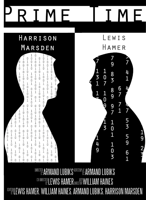
One of the posters that I am taking an inspiration from is Fist Fight, this is because of the instant connotations that you obtain from the characters facing each other with the intimidating look from one of the characters. However you can tell that this film is a comedy from the feeling it gives off with the comedic tagline and anxious look of Charlie Day compared to the very intimidating look of Ice Cube. This is obviously to aim to the primary audience for the film which will be teenagers who want to watch a comedy film so it has  bright colours and comedic features to appeal to that audience. Whereas our film has a much darker tone and is of the psychological thriller genre so if we were to use this idea of two characters facing each other showing their conflict and hate, we would have to adapt it a lot from how it is used in this film by toning the colours down, not using comedic effects etc. An idea for our film would be to have very basic colours such as black and white to show how their relationship and conflict is very primal and is just a hatred of one another compared to Fist Fight where it looks more trivial and childish which again links back to the School related storyline and comedy genre.

Shooting pack 2

Second day of filming

Me and my group have decided that we are going to film the office sequences in a college meeting room.

Equipment
Tripod
Camera
Zoom recorder

Script


Storyboard 


Shot list


Risk assessment

The camera/tripod could be dropped:

Transporting the camera and tripod:

The camera and tripod should be packed away safely into their respective bags. They should be strapped onto the people carrying them and not carried facing the road, blocking the path of people or in a position which could result in a drop. If there any damages while transporting this should be reported to the teacher. The equipment shouldn't be left unattended at any time.


People could fall:

If someone falls they should be checked to see if they are ok and if they need any medical assitance. If they are carrying any equipment this should also be checked for damages, however this is secondary to the students health. In a particular shot there are multiple chairs strewn across the ground which are a particularly high health hazard so the actors should take the upmost care when walking through the obstructions. Once the shots are done in this room the chairs should be picked up and moved back to their original positions. Any incidents should be reported to the teacher.


Monday, 8 January 2018

Film Poster Analysis

Film Poster - Pulp Fiction


The Title - The title of the film on film posters are normally around the top of the poster in the centre. This is so it is easy to identify the film as it is a norm amongst film posters. The title is also usually bigger than all the other text on the poster to outline the title and to draw the audiences attention to that so they know that it is important. Another feature of titles on film posters is that the title will look a lot different too the other text on the website, for example: different font, different colours, different style, etc. In all features mentioned, this "Pulp Fiction" film poster has all of them. The title is located near the top and is in the centre, the title is a bright yellow and is the biggest piece of text on the entire poster. This all highlights the title to the audience, and also establishes clearly what the title of the film is on the poster.

Cast - These are  the actors who feature within the film. These are usually a massive part of the film as this alone can draw people into watching the film as certain famous actors already have pre established fan bases that are just waiting to watch their favourite actor, act within the new film they are in. Having A list/ popular actors within films can also bring publicity to the film because news stations, magazines, news papers and the internet will be talking about the film because if the actors who play in it and also it being a new film. Along with this comes good advertisement because the film is then out there and is being talked about so more people will likely know about it first of all, and then see it. In film posters the way it is done is the actors who play in the film, only a handful will be chosen to be on the poster and the ones that do get chosen will be the main characters in the films actors and also the most "famous" actors within the film, to draw people into the film. On the example of Pulp Fiction, the main characters and also coincidently the most famous actors in the films, are at the top of the list of actors, so that the audience who will view the poser will see the names first, and will be drawn into the poster by this.

The Director - Sometimes on film posters the director will on the shown on the poster usually by saying something like: "A film by" or "Directed by". This is to give the director credit and also to draw in the audience as directors have a massive impact on the film and directors that have created good films in the past will have a reputation of a good director. In the case for Pulp Fiction, its director Quentin Tarantino is a well established director who had directed lots of films and has a good reputation in doing so. His name was added to the film poster of Pulp Fiction, under the title. The way it was done on the film poster was smart because you had the big Pulp Fiction yellow title, and then straight under it in a nice handwritten looking small black font it says "A Quentin Tarantino Film."

The Design - The design for the Pulp Fiction poster is themed as a old comic. It coveys this look of a comic in bad condition/ used. The way it shows us this is because it has random white lines meant to replicate creases and folds where the comic would look used. It pulls his off pretty well to give the aesthetic of a used comic, what also adds to this feel and reinforces the idea of it being a used comic is that in the mid left there is a price circle saying "10" so this isn't actually the rice of the film but is part of the used comic aesthetic purely because comic used to have prices on them.

The design of the poster is important because it allows the audience to get a feel of what the film is based around and the different things which will be included within the film. The Pulp Fiction poster has one of the main characters laid on the bed ( Uma Thurman) smoking a cigarette and there is a gun on the bed besides her. This will show the audience that the film will include sexualised women and will include element s of crime, mainly based on the gun, which is associated with crime, violence and murder.