Wednesday, 10 January 2018

Shooting pack 2

Second day of filming

Me and my group have decided that we are going to film the office sequences in a college meeting room.

Equipment
Tripod
Camera
Zoom recorder

Script


Storyboard 


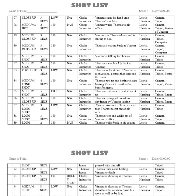
Shot list


Risk assessment

The camera/tripod could be dropped:

Transporting the camera and tripod:

The camera and tripod should be packed away safely into their respective bags. They should be strapped onto the people carrying them and not carried facing the road, blocking the path of people or in a position which could result in a drop. If there any damages while transporting this should be reported to the teacher. The equipment shouldn't be left unattended at any time.


People could fall:

If someone falls they should be checked to see if they are ok and if they need any medical assitance. If they are carrying any equipment this should also be checked for damages, however this is secondary to the students health. In a particular shot there are multiple chairs strewn across the ground which are a particularly high health hazard so the actors should take the upmost care when walking through the obstructions. Once the shots are done in this room the chairs should be picked up and moved back to their original positions. Any incidents should be reported to the teacher.


Monday, 8 January 2018

Film Poster Analysis

Film Poster - Pulp Fiction


The Title - The title of the film on film posters are normally around the top of the poster in the centre. This is so it is easy to identify the film as it is a norm amongst film posters. The title is also usually bigger than all the other text on the poster to outline the title and to draw the audiences attention to that so they know that it is important. Another feature of titles on film posters is that the title will look a lot different too the other text on the website, for example: different font, different colours, different style, etc. In all features mentioned, this "Pulp Fiction" film poster has all of them. The title is located near the top and is in the centre, the title is a bright yellow and is the biggest piece of text on the entire poster. This all highlights the title to the audience, and also establishes clearly what the title of the film is on the poster.

Cast - These are  the actors who feature within the film. These are usually a massive part of the film as this alone can draw people into watching the film as certain famous actors already have pre established fan bases that are just waiting to watch their favourite actor, act within the new film they are in. Having A list/ popular actors within films can also bring publicity to the film because news stations, magazines, news papers and the internet will be talking about the film because if the actors who play in it and also it being a new film. Along with this comes good advertisement because the film is then out there and is being talked about so more people will likely know about it first of all, and then see it. In film posters the way it is done is the actors who play in the film, only a handful will be chosen to be on the poster and the ones that do get chosen will be the main characters in the films actors and also the most "famous" actors within the film, to draw people into the film. On the example of Pulp Fiction, the main characters and also coincidently the most famous actors in the films, are at the top of the list of actors, so that the audience who will view the poser will see the names first, and will be drawn into the poster by this.

The Director - Sometimes on film posters the director will on the shown on the poster usually by saying something like: "A film by" or "Directed by". This is to give the director credit and also to draw in the audience as directors have a massive impact on the film and directors that have created good films in the past will have a reputation of a good director. In the case for Pulp Fiction, its director Quentin Tarantino is a well established director who had directed lots of films and has a good reputation in doing so. His name was added to the film poster of Pulp Fiction, under the title. The way it was done on the film poster was smart because you had the big Pulp Fiction yellow title, and then straight under it in a nice handwritten looking small black font it says "A Quentin Tarantino Film."

The Design - The design for the Pulp Fiction poster is themed as a old comic. It coveys this look of a comic in bad condition/ used. The way it shows us this is because it has random white lines meant to replicate creases and folds where the comic would look used. It pulls his off pretty well to give the aesthetic of a used comic, what also adds to this feel and reinforces the idea of it being a used comic is that in the mid left there is a price circle saying "10" so this isn't actually the rice of the film but is part of the used comic aesthetic purely because comic used to have prices on them.

The design of the poster is important because it allows the audience to get a feel of what the film is based around and the different things which will be included within the film. The Pulp Fiction poster has one of the main characters laid on the bed ( Uma Thurman) smoking a cigarette and there is a gun on the bed besides her. This will show the audience that the film will include sexualised women and will include element s of crime, mainly based on the gun, which is associated with crime, violence and murder.

Friday, 8 December 2017

Audience profiles

In terms of audiences, the film is aimed towards mostly males from 15-25. This is because it includes all males characters and not a single female one. The nature of the film is set in a work environment which would make it relatable for employed viewers and help them sympathise with the main character, Thomas. The film includes some violence making it not suitable for people under the age of 15. Audiences will be interested in similar films such as Horrible Bosses (2011) directed by Seth Gordon. The film follows three friends are they conspire to murder their awful bosses when they realize they are standing in the way of their happiness. This again appeals to employed viewers as they can sympathise with the workers and the struggles that are apparent in a workplace.

Treatment

Treatment

Name of the film: Prime
Length of film: 5 minutes
Distributor The distributor is StudioCanal UK
Age rating: 15

Audience: In terms of audiences, the film is aimed towards mostly males from 15-25. This is because it includes all males characters and not a single female one. The nature of the film is set in a work environment which would make it relatable for employed viewers and help them sympathise with the main character, Thomas. The film includes some violence making it not suitable for people under the age of 15. Audiences will be interested in similar films such as Horrible Bosses (2011) directed by Seth Gordon. The film follows three friends are they conspire to murder their awful bosses when they realize they are standing in the way of their happiness. This again appeals to employed viewers as they can sympathise with the workers and the struggles that are apparent in a workplace.

Summary: The film follows an employee at Clarke Industries called Thomas who is getting increasingly tired of his job which is further amplified by his boss, Vincent Clarke. One day, Thomas arrives to work where he can no longer put up with Vincent's egoistical demeanour. He starts to have numerous visions of him brutally murdering his boss and Vincent's famous catchphrase "Prime Time" starts to take over his mind, making him see prime numbers. He eventually can't take it anymore and plans to get rid of his arrogant, annoying boss.

Suggested elements: The main component that makes our film different from others is the heavy use of flashbacks. This is used to emphasises the fact that Thomas is losing his mind and the egoistical terror of Vincent Clarke is constantly making Thomas dream of the murder of his boss. This is amplified with the diegetic dialogue of Vincent, repeating his famous catchphrase "Prime time" over and over again.

Wednesday, 6 December 2017

Shooting pack 1

First day of filming

Me and my group have decided that we are going to film the opening sequences on Wednesday in a room in College.

Equipment
Tripod
Camera
Zoom recorder

Script


Shotlist


Storyboard


Risk assessment


The camera/tripod could be dropped:


Transporting the camera and tripod:

The camera and tripod should be packed away safely into their respective bags. They should be strapped onto the people carrying them and not carried facing the road, blocking the path of people or in a position which could result in a drop. If there any damages while transporting this should be reported to the teacher. The equipment shouldn't be left unattended at any time.


People could fall:

If someone falls they should be checked to see if they are ok and if they need any medical assitance. If they are carrying any equipment this should also be checked for damages, however this is secondary to the students health. In a particular shot there are multiple chairs strewn across the ground which are a particularly high health hazard so the actors should take the upmost care when walking through the obstructions. Once the shots are done in this room the chairs should be picked up and moved back to their original positions. Any incidents should be reported to the teacher.

Monday, 4 December 2017

A look into a Similar Film - William Haines

Similar Films

Horrible Bosses (2011)

Horrible Bosses, directed by Seth Gordon, is a story about a group of three coworkers who conspire to ruin or murder their bosses. Their motive is somewhat similar to the motive of our main character, the bosses are restricting the workers happiness and look down on them. Leading them to become mentally exhausted and in a need to find a solution. In which they find by going to the extreme of murder while the main character in our film decides to ruin the business through the use of a virus.

Both movies have characters with similar notives and similar characters. Despite the fact they could quit their job, they feel that it is not an option.

A major difference between both films is that Horrible Bosses could be said to be a 'Black Comedy'. While our film is aiming more towards being a psychological thriller. The main character in 'Prime Time' (our film) has sustained mental damage and is on the verge of going insane, the movie depicts his fall into insanity, at the end there is a resolution to the story that could be said to be happy, that is the case if you were to allign with the main character, which we are encouraging the viewer to do. Horrible Bosses also has a somewhat happy resolution.


 To do later:

  • Fight Club
  • Pi
  • Donnie Darko

Talk Show Banner for our Film Sequence

A part of our film sequence contains a scene where two characters are discussing something in an interview. For this scene, we required a banner which displays the name of the talk show so I designed one using Adobe Illustrator.

There are two methods you can use when applying the banner/image to the video.

One of them is creating a green screen behind the image. The image plus the green rectangle equals the same size/dimensions as the footage. When you insert the image into the media sequence in your chosen video editor, you then use the various tools and options given to you to delete the green space.

Another option is to export the image with a transparent background from the beginning. Either way has similar workflows, however, in terms of long term application, starting with a transparent background is probably the better option.

The banner has not been animated within the graphics program, which is an option that I could have pursued. We are instead going to animate the banner wiping across the screen in Adobe Premier. The added movement of the banner, instead of it appearing abruptly, would create a better dynamic. It also matches what other talk shows and media shows do.